An Inspirational Site!
How To Make Them Choose Your Book!

“You can fix anything but a blank page.” — Nora Roberts
“It’s none of their business that you have to learn to write. Let them think you were born that way.”
—Ernest Hemingway
The creative process in writing a book can vary from person to person, but generally it includes the following steps:
- Idea generation: This is the initial stage where the writer comes up with an idea for the book. It can come from personal experiences, observations, research or any other sources.
- Planning: Once the idea is generated, the writer starts to plan the story. This can include creating an outline, developing characters, and determining the structure of the book.
- Research: Depending on the subject matter of the book, the writer may need to conduct research to gather more information and add depth and realism to the story.
- Writing the first draft: This is the stage where the writer begins to put the story on paper. It’s a process of discovery, where the writer explores the story and characters, and finds out what works and what doesn’t.
5. Revising: After the first draft is complete, the writer goes through the manuscript multiple times to make revisions and improvements. This can include editing for grammar and style, and making changes to the plot and characters.
6. Editing: After the writer is satisfied with the manuscript, it is sent to an editor for further review and feedback.
7. Finalizing: After all the feedback is incorporated and the book is finalized, it is ready for publication.
It’s important to note that the creative process is not always linear, and writers may jump back and forth between different stages as they work on the book. The process can also be different depending on the genre, the format, the style and the goals of the book.
“A book is simply the container of an idea—like a bottle; what is inside the book is what matters.”
—Angela Carter

Let’s assume that you now have a smashing book. A gamechanger! If your audience is cats or dogs, you are ready to launch, as it’s more about being chewable, tasty, and having the ability to tingle one’s nose.
Books for students work the same as their teacher decide what books to buy. If not, continue reading.

The main goal is to reach our desired audience for our book. If all books were the same color, it would be about the story. But in reality, the cover catches the attention and sells the book.


- Keep it simple: A simple, clean design can be more effective than a busy, cluttered one.
- Use high-quality images: Use high-resolution images that are relevant to your book. This will help to attract the attention of your audience and make them want to learn more about your book.
- Use typography effectively: Use typography to create a hierarchy of information and guide the viewer’s eye. Use a font that is easy to read and that complements the overall design.
- Use color: Use color to create a mood and to draw the viewer’s attention to certain elements of the design.
- Use negative space: Use negative space to create balance and to draw the viewer’s eye to the focal point of the design.
- Use a professional designer: If you’re not confident in your own design abilities, consider hiring a professional designer to create a cover that will appeal to your target audience.
- Test the cover: Before publishing your book, test the cover with your target audience and get feedback. Use this feedback to make any necessary adjustments.
- consider the genre and the target audience: The cover should give an idea of what to expect from the content of the book.
- Make it stand out: Make sure your cover stands out from the competition and is easily recognizable on a bookshelf or online bookstore

“why is a picture of a face interesting to other people?”
A picture of a face is interesting to other people because faces are a powerful way for humans to communicate emotions and convey information. People have evolved to be very attuned to faces, as they are a primary means of social interaction. Additionally, faces are unique and can be used to identify individuals, which can also be interesting. Furthermore, faces can be used to tell stories, whether it’s capturing a moment in time, or expressing an emotion, people are drawn to look at them.
The art form in the picture above is superb. Text below from Nicole Belopotosky Every Art Blog.
Click on the picture to go directly to the blog. Opens in a new window.
“The face-book portrait sculptures you see below of “Louis Van Gaal”, “Anne Frank”, “Vincent Van Gogh” and “Kader Abdolah” were carved into their own autobiographies. The campaign was created by dutch agency Etcetera and was conceived by Markus Ravenhorst and Maarten Reynen. The sculptures were designed and created by Souverein.”
This is the ultimate Facebooks cover from an attention point of view.
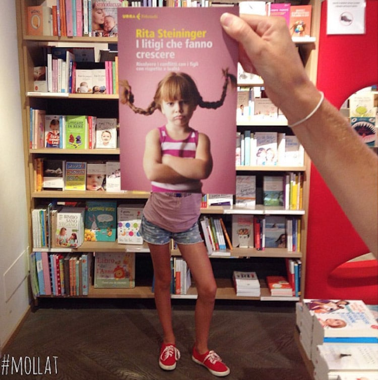
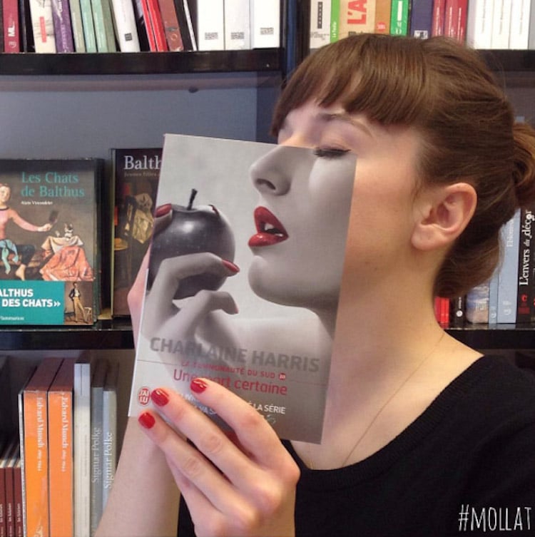
Above is an excellent example of book marketing using a model that integrates with the book’s cover. The Librairie Mollat, over 120 years old Bookstore and France’s first independent, seamlessly blends bock covers and faces. Their series is called Book Faces.
Click on any of the three pictures to go to the article fromMy Modern Met story.
Write, write, write, read, read, read! Search the net for ideas. Good luck with all stories that are yet to be written!


